Backdrop colour changes how a photograph is read before anyone notices the lighting diagram or lens choice. It can make a frame feel restrained, playful, premium, energetic or familiar. But backdrop colour psychology photography is not a fixed dictionary in which teal always means one thing and pink always means another. Meaning depends on the brand, product, audience, styling, culture, placement and surrounding colours.
For Delhi NCR brand teams planning a studio shoot, the useful question is therefore not “Which colour is most attractive?” It is “Which colour helps this specific image do its job?” The answer should connect creative intent with practical production decisions.
Start with the placement, not the paint chart
A website hero, marketplace listing, founder portrait and reel cover have different jobs. The website hero may need negative space for copy. A listing image may need a neutral or removable background. A reel cover needs strong separation at phone size. A campaign portrait can carry a more distinctive colour because it is designed to build recognition rather than describe a product clinically.
List every placement before selecting the wall. Include aspect ratios, crop-safe zones, text overlays and whether the image will sit beside other campaign assets. A colour that looks balanced in a wide frame can dominate a tight vertical crop.
Use colour to support a brand behaviour
Instead of attaching a vague emotion to a colour, define the behaviour the brand wants from the frame. Should the image feel calm enough for a financial-service founder? Energetic enough for a creator launch? Warm enough for a home or food product? Graphic enough to stop a social scroll?
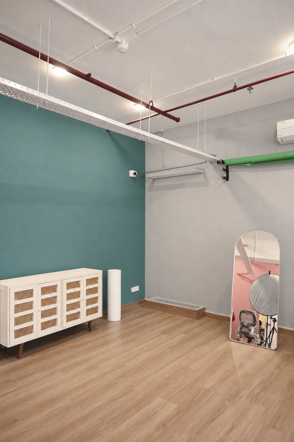
Neutral grey can keep attention on form, expression and product colour. Beige adds warmth and a lived-in quality. A soft blush can make beauty, fashion and lifestyle work feel friendly without becoming loud. Teal can create strong contrast and a recognisable contemporary set. These are starting points, not guarantees. Lighting, wardrobe and styling can move each colour in a completely different direction.
Think in palettes rather than isolated colours
A backdrop never appears alone. It sits beside skin, hair, packaging, clothing, furniture, plants and props. Build a small palette before shoot day: one dominant colour, one supporting colour and one or two accents. Photograph or mock up the actual product and wardrobe against that palette rather than judging paint swatches on a laptop.
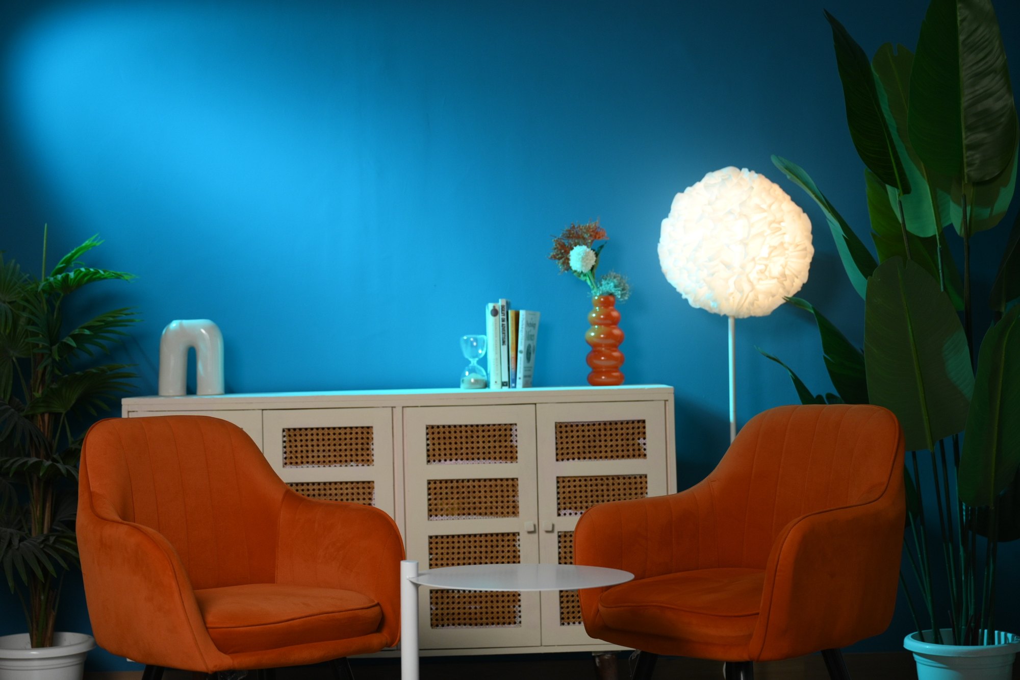
Contrast can be tonal, warm-versus-cool or complementary. An orange chair against teal feels graphic because both hue and value separate. A beige outfit on a beige wall can feel refined when silhouette and texture remain clear, but it can also become flat if subject and background share the same brightness.
Protect accurate skin and product colour
Coloured surfaces reflect some of their colour into nearby subjects. A saturated wall placed close to a face, white garment or reflective package can create a visible cast. Increase subject-to-wall distance when the frame allows, control spill with flags or grids, and use a directional key light that gives the subject a reliable colour reference.
For cosmetics, apparel and packaged goods, decide which colours must be reproduced accurately. Capture a reference target when useful and review tethered files on a calibrated display. A dramatic set is not successful if a customer receives the wrong impression of the product shade.
Control how light changes the wall
The camera records the lit surface, not the paint name. A teal wall can appear deep and restrained under controlled exposure or bright and playful under a broad wash. Beige can move from neutral to golden as the light warms. Grey can become cool, warm, pale or nearly black depending on exposure, spill and white balance.
Test the wall with the intended key light and camera profile. Check corners and gradients in the widest frame. If stills and video are required, repeat the test with continuous fixtures and the final frame rate. Our cyclorama lighting guide explains the same exposure principle on a white surface.
Match colour intensity to the funnel stage
Top-of-funnel campaign and social images often have room for bolder colour because their first job is recognition. Consideration content—tutorials, comparisons and founder explanations—usually benefits from a set that is distinctive but not distracting. Conversion assets need clarity: legible product features, reliable colour and space for price, copy or interface elements.
A single production day can cover all three. Photograph the strongest campaign composition first, then simplify props or shift to a quieter wall for instructional and product-led frames. Plan the order so lighting and furniture moves remain efficient.
Build a colour test into pre-production
Ask the studio for current wall photographs, but treat them as references rather than exact colour promises. Screens, ambient light and camera processing all change appearance. Share wardrobe photographs, product pack shots and brand colour values before the shoot. If the campaign depends on a precise relationship, schedule a short pre-light or create test frames before talent call time.
- Define the placement, crop and job of every image.
- Build a palette using the real product, wardrobe and props.
- Check subject separation in both wide and vertical frames.
- Test colour spill on skin, white fabric and reflective packaging.
- Record lighting, white balance and camera settings for continuity.
- Approve a tethered reference before completing the full shot list.
Compare the available surfaces in our guide to the best studio wall colour for a photoshoot. You can also review Sooper Studios, browse finished studio examples, explore production services or share your palette and deliverable list for a practical recommendation.
Frequently asked questions
Does every backdrop colour have a fixed psychological meaning?
No. Colour associations change with context, culture, styling, lighting and the other colours in the frame. Use audience and brand references rather than a universal chart.
Which backdrop colour is safest for product photography?
Grey, beige and white are flexible starting points, but the safest choice depends on product colour, required cut-outs, placement and brand palette.
Can a coloured wall affect skin tones?
Yes. Reflected colour can contaminate skin and pale wardrobe. Distance, flags, directional lighting and careful white balance help control the cast.
Should the backdrop match the exact brand colour?
Not always. A complementary or neutral surface may create better separation. If an exact match is important, test it on camera and plan for controlled grading.