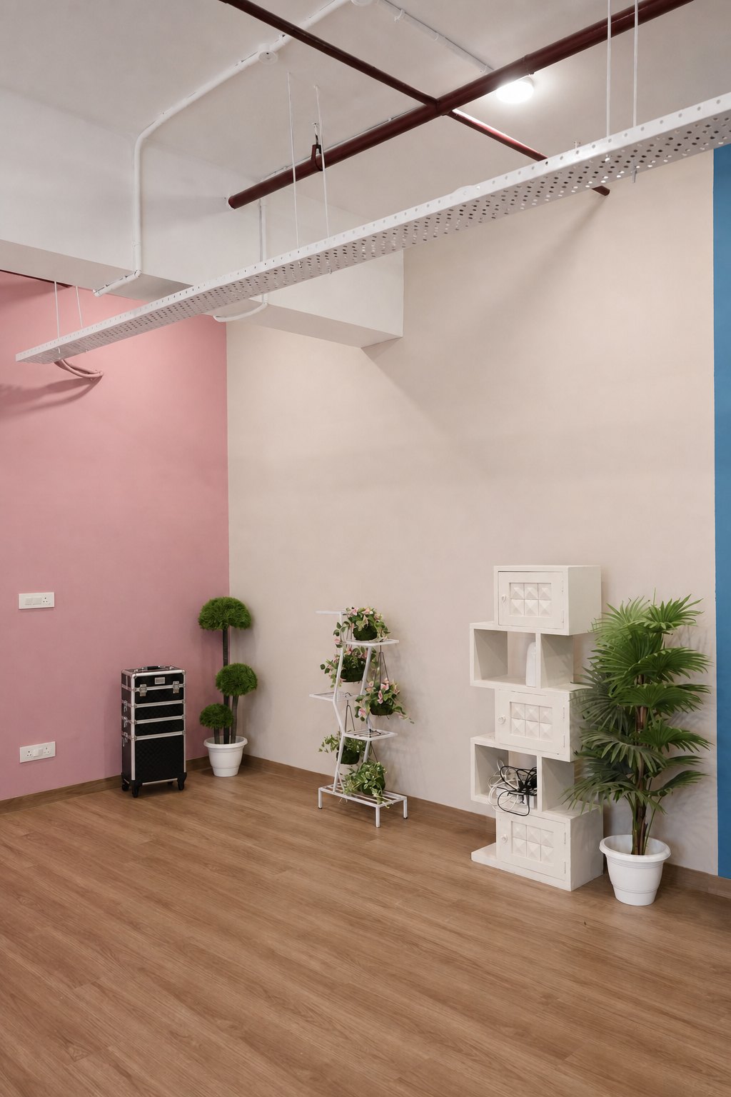
Beige, blush pink, teal and grey can all produce professional photographs, but they solve different visual problems. Choosing the best studio wall colour for photoshoot planning is less about picking a favourite and more about matching the surface to the subject, deliverable and lighting approach.
This comparison is for Delhi NCR brands, photographers and creators who want several useful looks from one studio session. It covers where each wall tends to work, what can go wrong and how to test the choice before the crew begins the full shot list.
Use beige for warmth without a loud colour statement
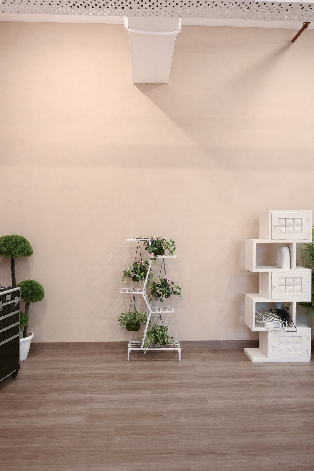
Beige is useful when a frame should feel warm, natural and easy to place across a website or social feed. It suits home, wellness, food, fashion, personal-brand and lifestyle stories. Wood, cream, rust, olive and muted packaging can build a cohesive palette around it.
The risk is low separation. Pale products, cream clothing and warm skin can merge with the wall when their brightness is too similar. Create depth through subject distance, a darker or cooler accent, side light, negative fill or a clearer silhouette. Also monitor yellow or orange spill when warm fixtures and beige surfaces are combined.
Choose blush pink for friendly beauty and lifestyle frames
A soft blush wall can feel approachable, optimistic and contemporary without the intensity of a saturated pink paper roll. It works well for beauty, accessories, creator content, gifting, fashion and playful product stories. Deep green plants, red accents, brown wardrobe and clean white surfaces give it useful contrast.
Check red and magenta products carefully. Similar hues can lose their edges, while reflected pink can affect pale packaging and skin. Keep the subject away from the wall when possible and test a neutral key light before adding warm practicals or coloured accents.
Use teal when the brand needs contrast and recognition
Teal is the boldest of these four surfaces. Orange, coral, cream, white and warm wood stand out strongly against it, which makes it useful for podcasts, interviews, campaign portraits, creator series and graphic lifestyle sets. A recurring teal environment can also make a content series recognisable.
Because the colour carries visual weight, keep the prop palette disciplined. Several unrelated saturated colours can make the frame noisy. Teal can also reflect into skin or white clothing, so control spill and review jawlines, product edges and shadow areas on a tethered frame.
Choose grey for flexibility and controlled emphasis
Grey is strong when the subject, product or wardrobe should lead. It works for corporate portraits, technology, product demonstrations, interviews and catalogue variations. Grey also accepts coloured light well, allowing a crew to create several moods without physically changing the background.
It can feel flat when the subject shares the same tonal value. Add separation with a rim light, a warmer prop, textured wardrobe or greater distance. Confirm whether the wall reads cool or warm under the intended white balance; “grey” does not automatically mean colour-neutral on camera.
Compare the four walls against the actual brief
- Beige: warm lifestyle, home, wellness and understated fashion; watch tonal blending.
- Blush pink: friendly beauty, gifting and creator work; watch reflected magenta.
- Teal: graphic campaigns, interviews and recognisable series; keep accents controlled.
- Grey: flexible portraits, products and demonstrations; build deliberate separation.
Now add the real constraints: product colour, wardrobe, number of people, widest composition, vertical crop and text placement. A teal wall may win for a bold 9:16 cover while grey wins for a technical product demo. It is reasonable to use two walls in one day when each is tied to a different deliverable.
Plan transitions before shoot day
Moving between walls takes more than moving the camera. Furniture, plants, lighting, power, monitoring and product staging may all need to shift. Group shots by surface and lighting state rather than following the final content calendar order. Finish every wide, mid, close and vertical variation before resetting the set.
For teams travelling from Delhi, Gurgaon, Faridabad or Ghaziabad to Noida, an efficient wall plan protects the time lost to traffic and loading. Share a floor plan or reference gallery with the crew, then include setup and pack-down time in the booking.
Test skin, fabric and packaging
Place the actual product and one approved wardrobe option in front of the preferred wall. Check edge separation at thumbnail size, not only on a large monitor. Review reflective packaging for unwanted colour, white fabric for contamination and dark hair or clothing for lost detail.
If a precise brand colour must appear, capture a reference and discuss grading before the shoot is complete. The recorded wall colour changes with exposure and light; it should not be judged by its paint name alone. Our backdrop colour psychology guide explains how context affects the result.
Choose one primary wall and one fallback
Approve a primary wall for the main idea and a fallback for practical variations. The fallback can solve wardrobe clashes, a late product change or a deliverable that needs more negative space. Keep it simpler so the change does not require a complete rebuild.
Browse the Sooper Studios gallery and review the studio layout before finalising the plan. You can explore production support or send the shot list, wardrobe and product references for a wall and lighting recommendation.
Frequently asked questions
Which studio wall colour is most versatile?
Grey and beige are usually the easiest starting points, but versatility depends on the product, wardrobe, lighting and crop requirements.
Is teal suitable for professional portraits?
Yes, especially for creative founders, speakers and branded series. Control reflected colour and keep wardrobe and props visually disciplined.
Can we use more than one wall in a single booking?
Often yes, provided the shot list includes realistic transition time for moving furniture, lighting, monitoring and products between setups.
Should wardrobe match or contrast with the wall?
Either can work. Tonal matching feels refined when edges remain clear; contrast is safer for small crops and fast-moving social content.