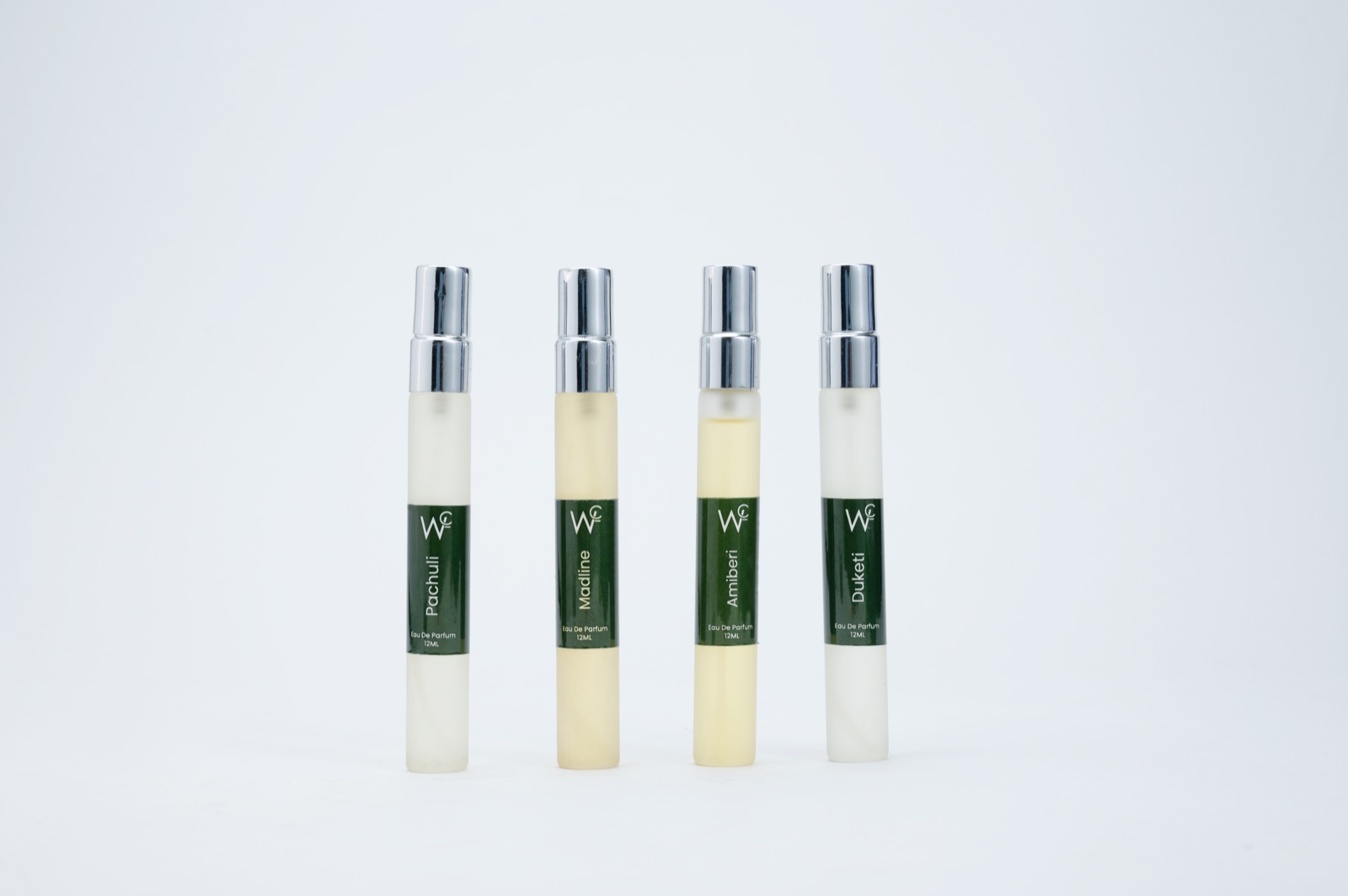
Amazon listing images and A+ Content support the same product page, but they do not perform the same job. The listing gallery is encountered near the buying controls and must make the product understandable quickly. A+ Content appears deeper on the page and gives a brand more room to explain features, uses, comparisons and story.
For a Delhi NCR product team, this distinction affects the brief, set design, crop strategy and production schedule. Treating both deliverables as one undifferentiated group often creates repeated imagery and missed information. Treating them as completely separate productions can waste budget. The practical answer is one coordinated shoot with two clearly defined visual systems.
What listing images need to accomplish
The listing gallery should identify the exact product, show what is included, cover important angles and help a shopper judge details quickly. The main image has specific marketplace constraints, while secondary images can communicate features, scale, use and packaging more creatively.
Because gallery images are viewed in sequence, plan them as a concise argument. A common logic is: recognise the product, understand the contents, see important details, judge size, see it in use and resolve the strongest objection. The exact order should reflect the category and the customer’s decision process.
What A+ Content needs to accomplish
A+ Content provides modular space below the main buying area. Amazon describes it as enhanced product and brand information that can combine images, rich text and comparison elements. This is where the brand can explain how features work, show a process, give context and connect related products.
A+ imagery therefore benefits from narrative. Instead of another isolated product angle, it may show a sequence, a wider environment, a close-up paired with explanatory copy or a family of products photographed consistently. The best frame is not always the one with the most dramatic styling; it is the one that fits the intended module and makes the message clear.
The central difference: recognition versus explanation
Listing imagery is usually optimised for rapid recognition and evaluation. A+ imagery is optimised for deeper explanation and brand confidence. There is overlap—both should be accurate and polished—but the emphasis changes.
- Listing hero: unmistakable product identification.
- Listing secondary frames: angles, features, scale and use.
- A+ feature modules: benefits supported by evidence or demonstration.
- A+ lifestyle modules: audience, environment and use context.
- A+ comparison content: consistent views across a product family.
Where the same master photograph can work
A well-planned lifestyle master can sometimes produce a tighter secondary listing crop and a wider A+ crop. A consistent product-family image may support both a listing infographic and an A+ comparison section. A macro detail can become a standalone gallery frame and a supporting visual beside A+ copy.
The production should capture enough resolution and negative space for these adaptations. However, do not force every image to serve every placement. Amazon’s A+ guidance encourages unique content rather than simple repetition of the listing gallery.
Where you should create separate setups
The main listing image often requires a clean, compliant presentation that is fundamentally different from a styled brand-story scene. A+ content may need wide environmental compositions or multiple products arranged for comparison. Those are separate setups even if they happen on the same studio floor.
Create a setup list before the shoot: clean catalogue, feature close-ups, scale demonstration, lifestyle environment, product family and brand story. Group shots by lighting and set requirements rather than jumping between channels after every frame.
How cropping requirements change the composition
Listing galleries frequently favour square or near-square crops, while A+ modules include a range of wide, compact and multi-image layouts. Module availability and specifications can change, so verify the current options in Seller Central before production.
For wide modules, keep the subject away from the edge and leave a clean area for adjacent text where the design requires it. For square gallery frames, make sure the product remains visually strong without relying on background width. Capture both horizontal and vertical breathing room whenever the set allows.
How text and graphics affect the shoot
Photographs should be captured cleanly first. Add dimensions, arrows, feature labels and explanatory typography during design, not permanently in the camera file. This keeps the master reusable and makes corrections easier.
Share likely text areas with the photographer so the product is positioned intelligently. Keep essential product information visible without requiring tiny type. Amazon’s guidelines prohibit or restrict several kinds of promotional, time-sensitive and external-contact content, so the brand should review claims before design.
Plan one efficient production day
A coordinated shoot can serve both systems when the brief is organised. Start with the clean product set and catalogue angles. Move to macro or functional demonstrations while lighting is controlled. Then build lifestyle and brand-story sets. Finish with product-family or comparison frames once all variants are checked.
For teams travelling from Delhi, Gurgaon, Faridabad or Ghaziabad, prepare products and approvals before arrival. The Noida studio setup can support clean packshots, coloured walls and styled scenes in one location, reducing travel between multiple sets. Review the studio gallery to identify surfaces and environments relevant to the brief.
A deliverable matrix prevents confusion
Create one row per final asset and include the product or ASIN, shot description, channel, crop, copy-safe direction, retouching level and approval status. Label shared masters explicitly. This prevents the design team from assuming a gallery image was intended for A+ or discovering after the shoot that a wide module has no suitable frame.
Link the matrix to the broader product photography brief. The brief defines the commercial objective and production responsibilities; the matrix defines how each photograph will be delivered and used.
Frequently asked questions
Should listing images and A+ Content look identical?
They should feel like the same brand and represent the product consistently, but they do not need identical compositions. Each system should be designed for its position and information job.
Can A+ lifestyle images include text?
A+ modules can combine imagery and text, but requirements and restrictions apply. Capture clean photographs and add reviewed copy within the appropriate module or design workflow.
Is it cheaper to shoot listing and A+ images together?
It can be more efficient because products, lighting and crew are already assembled. Savings depend on how many additional sets, props, models and approvals the A+ plan requires.
The useful question is not “listing or A+?” but “what must each placement help the customer understand?” If your team has a live module plan, share the product list and required channels for a production estimate that separates shared assets from genuinely different setups.